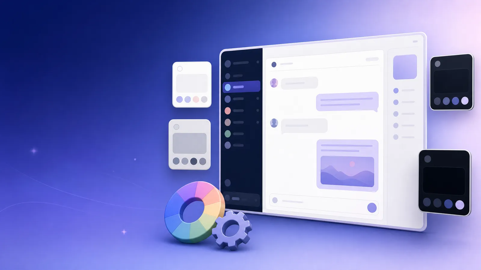
Discord’s appearance settings now go well beyond a simple choice between light and dark mode. Through the official Appearance and Accessibility settings, users can adjust default themes, content spacing, zoom level, chat font size, color saturation, and contrast across the desktop, browser, and mobile clients. Nitro subscribers can also use color themes and create custom gradient themes. Based on Discord’s current official Help Center guidance, this article explains what each setting does, where it is available, and how to use it effectively—while highlighting the differences that can be confusing between desktop and mobile.
Reader note: Discord continuously updates its clients and runs limited feature experiments. As a result, menu labels, available options, and interface layouts can vary slightly by device, app version, region, or test eligibility. The paths below follow Discord’s official documentation. If your interface does not match exactly, update the client first, then look for the equivalent option under Appearance or Accessibility.
Start by Separating the Four Types of Appearance Controls
Before changing any settings, it helps to distinguish between several related—but different—features in Discord. Default themes set the interface’s baseline brightness and neutral colors. Display layout settings control the use of space and text readability. Accessibility settings address preferences around color, contrast, and motion. Color themes and custom themes are additional visual customization options available through Nitro.
Appearance Controls at a Glance
Switch between light, gray, dark, or near-black interfaces. Go to User Settings > Appearance. This is best for matching day/night preferences or the system appearance; Nitro is not required.
Make the interface denser or roomier. Go to User Settings > Appearance > UI Density / Message Spacing. This is best for managing screen space, information density, and reading rhythm; Nitro is not required.
Enlarge the interface or only the chat text. Go to User Settings > Appearance. This is best for changing font size and overall scale; Nitro is not required.
Adjust saturation, contrast, or animation. Go to User Settings > App Settings > Accessibility. This is best for color sensitivity, contrast, and motion preferences; Nitro is not required.
Apply color themes or create a custom gradient theme. Go to User Settings > Appearance > Theme / Color Themes. This is best for personal style and brand-color alignment; Nitro is required.
1. Change Your Discord Theme on Desktop and in the Browser
On Windows, macOS, or the browser client, select the gear icon beside your avatar in the lower-left corner to open User Settings, then choose Appearance. The default theme area offers five choices: Light, Ash, Dark, Onyx, and Sync with computer. Selecting a theme applies it immediately; no restart is required.
Default Desktop Theme Options
Light uses a white background with dark gray text and offers an optional Dark Sidebar. It works well for a brighter workspace or reading in strong ambient light.
Ash uses a mid-gray background with white text. It can reduce the starkness of pure black or white while retaining a dark environment.
Dark uses a dark gray or charcoal background with white text. It is a general-purpose dark interface for most low-light settings.
Onyx uses gray and black backgrounds with white text. It suits users who prefer a deeper, near-black presentation.
Sync with computer follows the computer’s system appearance setting. It is useful for automatically switching between system light and dark modes.
The Dark Sidebar available with the Light theme deserves special attention. When enabled, server lists, direct messages, and channel lists remain dark while the main chat area stays light. This hybrid layout can work well for users who want a bright reading surface but stronger visual separation in navigation.
If you do not subscribe to Nitro but want to decide whether a color theme suits your chat environment, use Preview Theme on the desktop client to open the preview sidebar. Discord confirms that non-Nitro users can preview these themes on desktop, although applying the additional color themes still requires the applicable subscription eligibility.
2. Change Your Mobile Theme—and Interpret “Sync” Correctly
The path is different on mobile. In the Discord app, tap your avatar at the bottom right, tap the gear icon at the upper right, scroll down, and open Appearance. The standard mobile options are Light, Dark, Midnight, and Automatic; Automatic follows your phone’s system appearance setting.
The most common source of confusion is assuming that theme names map one-to-one across platforms. Ash on desktop may appear as Dark on mobile, while desktop Onyx appears as Midnight on mobile. When Sync across clients is enabled on desktop, the preference can sync to desktop, mobile, and browser clients, but the visual result can still vary by platform. If visual consistency between your phone and computer is especially important, open Appearance on both devices and check the final result rather than relying only on the theme name.
3. Make the Interface Easier to Read: Density, Message Display, and Font Controls
A theme controls the overall tone, while layout settings determine how information is arranged on screen. Discord places both types of controls under Appearance, so they can be combined. For example, Dark does not require a compact layout: you can use a dark theme while increasing text and message-group spacing for a more relaxed reading cadence.
Layout and Readability Controls
UI Density offers Compact, Default, and Spacious layouts. It changes the spacing around content and, on desktop, navigation spacing as well. Try Compact for many channels and high-volume communication, or Spacious for longer reading sessions.
Chat Message Display offers Default and Compact layouts and changes the spacing between message elements. Compact removes user icons, which is useful when you want to see more messages on screen.
Zoom Level is adjusted with a slider; browsers use their built-in zoom. It changes the size of all Discord elements, including text. Adjust overall zoom first, then fine-tune chat text to avoid unnecessary line wrapping.
Chat Font Scaling adjusts chat text separately and compounds with Zoom Level while leaving other interface elements unchanged. It is useful when you want larger conversation text without enlarging the sidebar.
Message Group Spacing adjusts the space between message groups. Increase it modestly for dense discussions or long messages to create more visual breathing room in chat history.
An efficient adjustment sequence is to select the theme first, set Zoom Level second, adjust Chat Font Scaling third, and only then decide on UI and message spacing. Zoom affects the size of every element, and chat font scaling is layered on top of that base. Following this sequence reduces unnecessary back-and-forth adjustments.
4. For Nitro Users: Color Themes and Custom Gradient Themes
Nitro users can access additional themes in the Color Themes area of Appearance and can build themes of their own. Discord’s current guidance states that a custom theme can use either a dark or light base palette, with colors selected through the color field, hue slider, or direct Hex value input.
To create one, navigate to User Settings > Appearance > Theme and select the Custom Theme icon. In the editing sidebar on the right, choose a light or dark base palette and set the initial color. To create a gradient, use Add Color to introduce additional colors. A gradient supports up to five colors. Once at least two colors have been added, the Gradient Direction control becomes available; Color Intensity can then be used to adjust the perceived vividness. Select Apply when you are satisfied to save the theme.
Custom Theme Controls
Light/dark base palette determines whether the theme is built on a light or dark foundation. Choose the base first, then choose the colors; do not judge a swatch in isolation.
Color field, hue slider, and Hex precisely select an individual theme color. If you already use a brand or desktop palette, entering a Hex value is more consistent.
Add Color adds colors to a gradient, up to five total. Two or three colors usually preserve hierarchy more effectively; too many can weaken it.
Gradient Direction changes the flow direction of multiple colors. Use it to influence where visual emphasis lands across navigation, headers, or chat areas.
Color Intensity controls the perceived strength of the colors. For text-heavy use, avoid excessive intensity and prioritize background/text distinction.
Surprise Me / Reset generates a random combination or restores the previous custom theme. Use random combinations for inspiration, then rely on Reset as a safe rollback.
Custom themes can be saved and shared. According to the Help Center, Nitro users can create, share, preview, and apply custom themes on desktop and the browser client; mobile is currently limited to previewing and applying shared or existing custom themes. Therefore, create a new theme on the desktop client or in the browser, while mobile remains suitable for applying a theme that already exists or has been shared with you.
5. Do Not Overlook Accessibility: Color, Contrast, and Motion
Appearance personalization should not focus on color alone. Discord centralizes related options under User Settings > App Settings > Accessibility; on mobile, open User Settings from the bottom-right avatar and then select Accessibility. These controls work alongside themes and are especially helpful for users who need to tune color richness, contrast, or animation-related distractions.
The Saturation Slider adjusts the richness of colors throughout the Discord client. If a high-intensity gradient theme feels visually crowded, try lowering saturation before reassessing the visibility of text, channel states, and role colors. Users who are sensitive to motion—or simply prefer a quieter interface—can also set sticker animations to always animate, animate on interaction, or never animate.
High Contrast Mode works with all themes on desktop and improves contrast for UI elements throughout the client. Windows users will also see Sync contrast settings. If Windows High Contrast Mode is active and this sync is enabled in Discord, Discord adopts the system’s theme colors. Discord specifically notes that when client sync and high contrast are both enabled, the original Light and Dark theme choices may be disabled; turning the sync off restores Discord’s original theme options.
6. Server Themes and Personal Themes Are Not the Same Thing
In addition to a user-selected client theme, Discord is testing Server Themes for selected servers. According to the official documentation, this is an experimental feature available to some servers: server administrators can configure it through Server Settings > Server Theme once the server has three Server Boosts. Members can choose whether to view the server theme while in that server or retain their own device theme.
In other words, a server theme is an environment-level setting for a particular server, while Light, Dark, Onyx, or a custom theme is a personal client preference. If the colors in a given server do not suit your reading preferences, you do not need to change your global theme; check whether you can switch back to your personal theme instead. Because this feature is experimental, eligibility and availability may change.
7. Three Practical Configuration Patterns
Daily Commuting and Automatic Device Switching
Choose Sync with computer on desktop and Automatic on mobile, then check both clients after enabling cross-client sync. This reduces manual switching while respecting the device system’s light/dark preference.
High-Volume Community Management and Information Triage
Use Dark or Ash with Compact UI Density and Compact Message Display; raise overall zoom slightly if needed. This fits more channels and messages on one screen and supports high-frequency conversation handling.
Long Reading Sessions, Study, or Text Collaboration
Use either Light or Dark with Default or Spacious UI, appropriate Chat Font Scaling, and slightly increased Message Group Spacing. This uses clearer text and intentional whitespace to create a stable reading rhythm.
These configurations are not fixed prescriptions. A more reliable approach is to settle on one theme, change only one layout variable at a time, and observe the result for a day or two. Changing theme, zoom, font, and density all at once makes it difficult to identify which adjustment actually improved your experience.
8. Common Questions and Troubleshooting
Why does Ash appear on my computer but Dark appear on my phone? This is a cross-platform theme-mapping difference, not a failed setting. Discord explicitly states that Ash on desktop appears as Dark on mobile. Sync transfers the theme preference between clients; it does not guarantee identical names or rendering on every platform.
Why can I preview a color theme but not apply it? Discord lets non-Nitro users preview themes on desktop, but additional color themes and custom themes are Nitro features. Distinguish carefully between preview access and eligibility to apply a theme.
Why did my original Light or Dark theme disappear after I enabled Windows high contrast? Check Sync contrast settings in Accessibility. When this setting and Windows High Contrast Mode are active together, Discord adopts the system contrast colors and temporarily disables the original theme choices. Turn the sync off to restore Discord’s original themes.
Why do I not see Server Themes? Server Themes are currently experimental for selected servers and require the server to meet Discord’s stated Boost condition. The absence of the setting usually reflects eligibility, server configuration, or the feature’s staged availability—not a problem with your personal theme settings.
Conclusion: Turn “Looking Good” into a Sustainable Reading Experience
A well-considered Discord appearance setup should account for color tone, text size, information density, cross-device consistency, and accessibility needs. Free users can create a highly personalized experience with default themes, Dark Sidebar, zoom, fonts, spacing, saturation, and high-contrast controls. Nitro users can go further with color themes and custom gradients of up to five colors.
Start with the smallest useful change: choose a base theme in Appearance, adjust zoom and chat font size, then add density controls, accessibility color controls, or a Nitro custom theme as needed. This approach helps keep the interface attractive without making it difficult to read—and ensures that each setting supports your communication and reading habits.